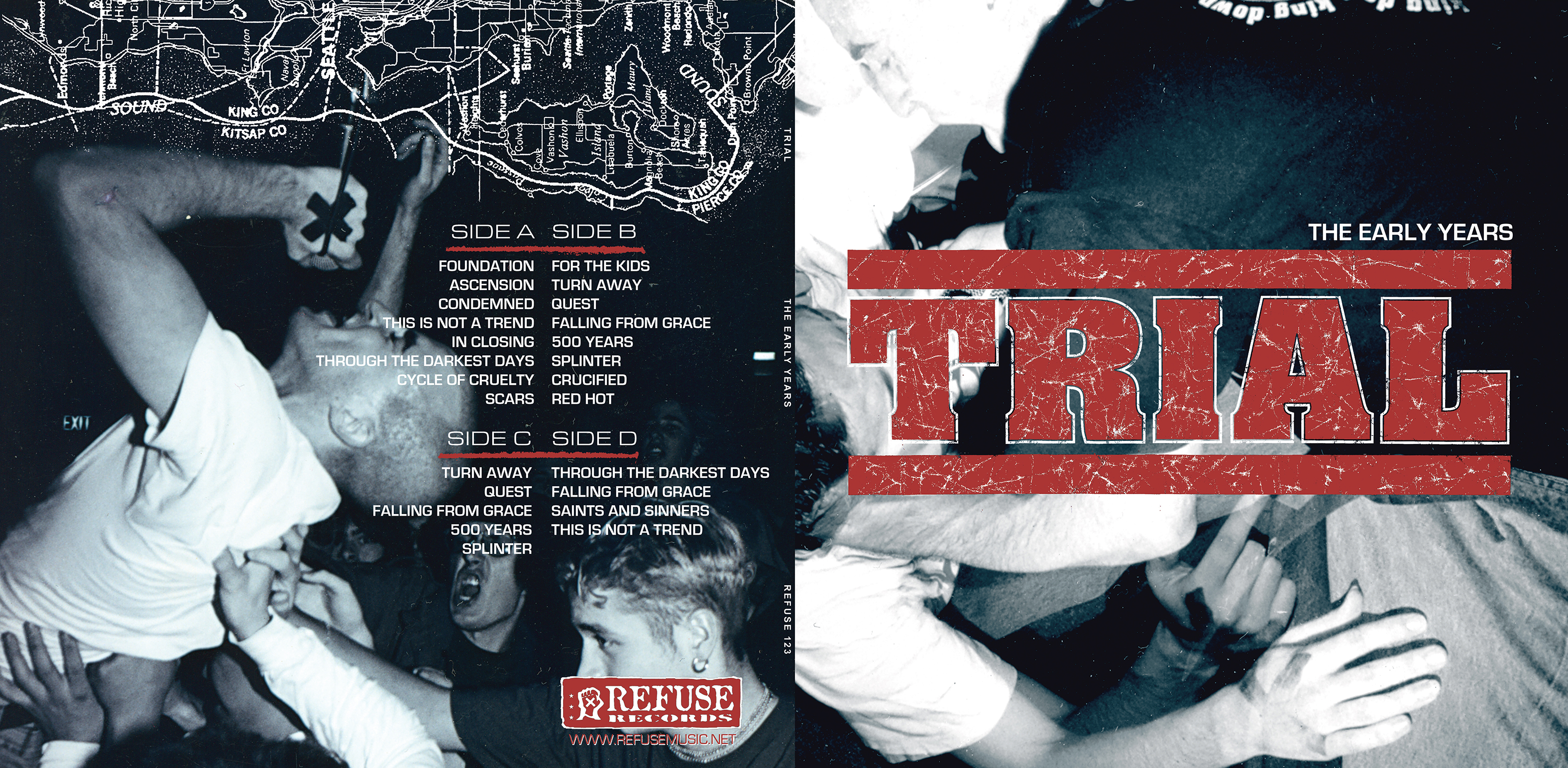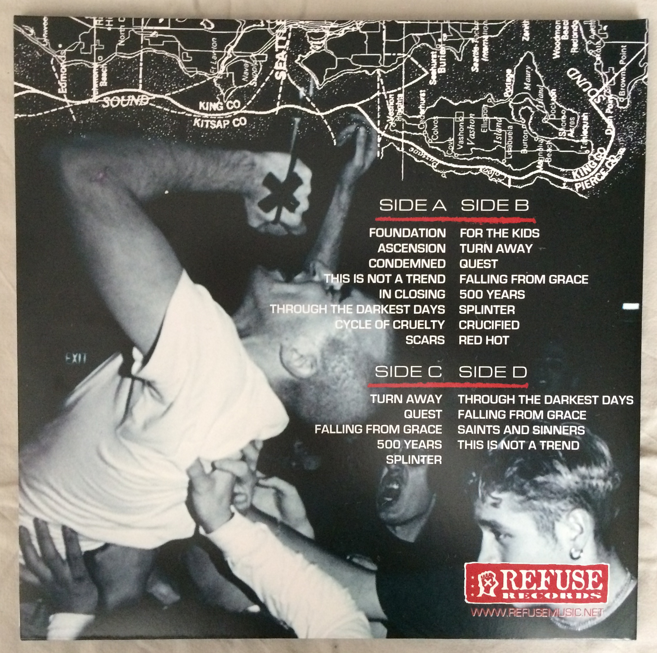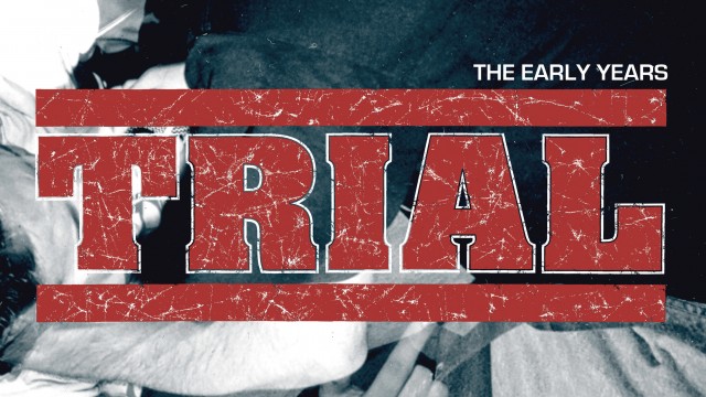
Trial – The Early Years
I am usually weary about designs where things need to be just perfect in terms of margins, centralization and so on, and I’ll be honest and say that this design was a bit of a pain in the ass. But regardless of numerous changes in its general direction along the way – forcing me to re-think, re-do and at times re-evaluate my patience – I am very excited over how it came out and satisfied that I kept working on it. I first came to know Trial through the ”Through The Darkest Days” 7″, which I bought a local record store in my hometown when it first came out. The 10″ followed, and then I ordered the fullength upon its release (only as a CD though). I’ve always considered ”Are These Our Lives?” among the top records of the years around the millennium, and one that somehow sums up a lot of the 90s in both sound and attitude.
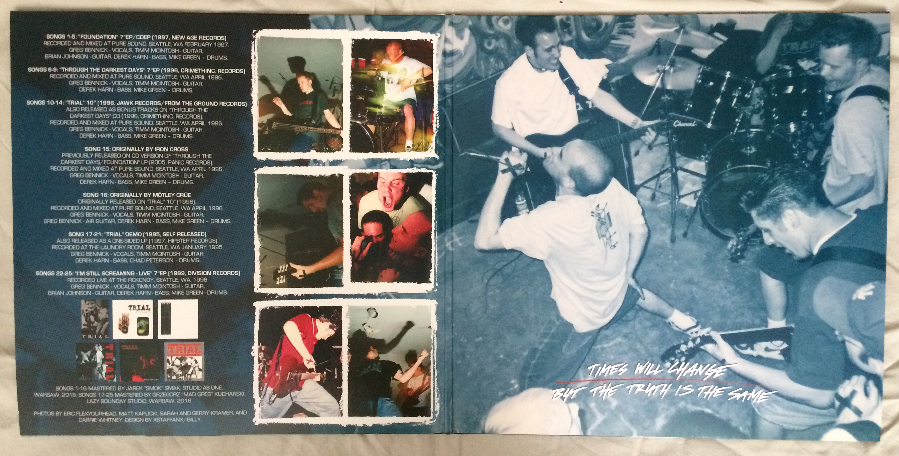
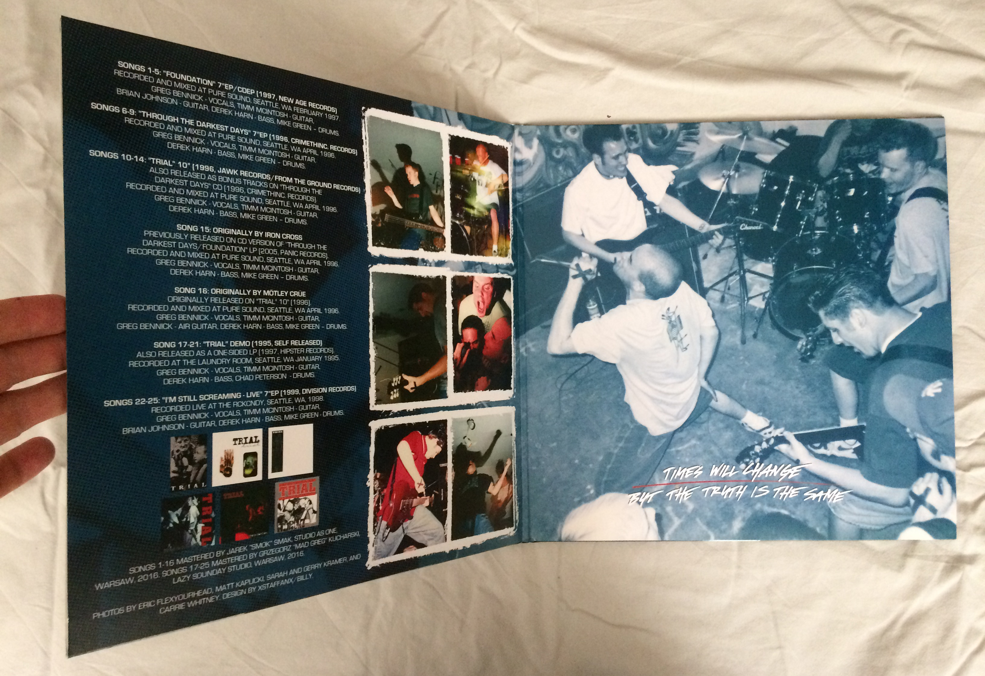
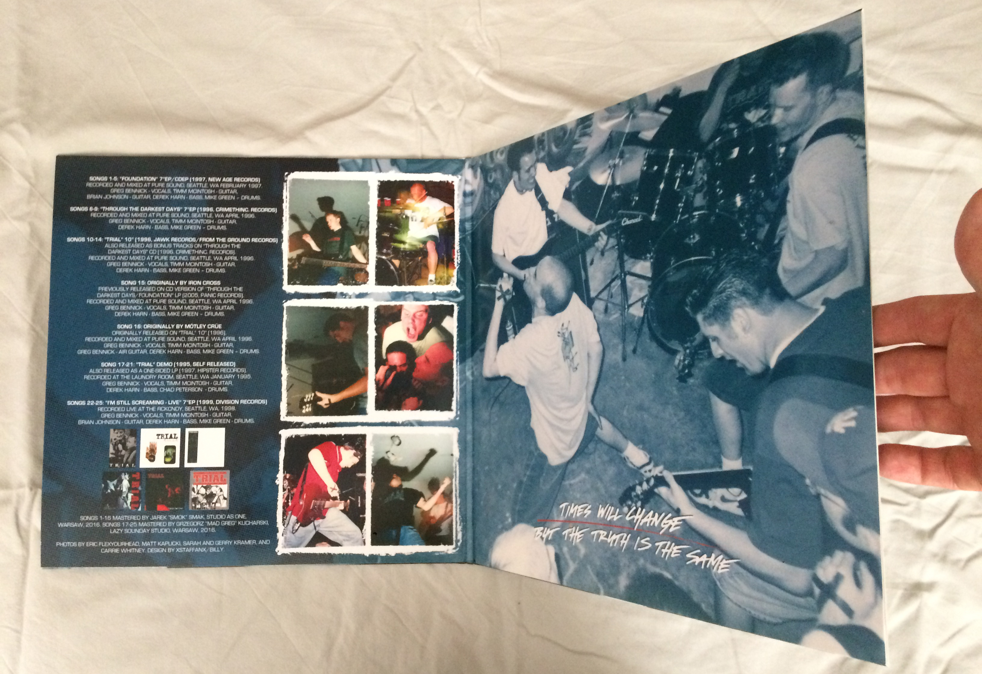
I love working with Robert Refuse so when he asked me to do this design I felt honored. It grew from a regular sleeve to a gate-fold, from a single record to a double record and so on, but hey, in the end it just meant a gradual transformation to the massive product that it is. I have no claim to the gigantic booklet, in fact I turned down working on it due to other commitments, and I also did not do the labels. My work is strictly limited to the gate-fold sleeve.
I was supplied with awesome photo material, and I wanted to blow them up big. I added parts of a map of Seattle at the top of the back cover. I had plans to replace something on the map with a word or name that would be a little thorn in the side of Greg, just to screw around, but I felt like wouldn’t feel sure that it would blend in properly so I skipped it. Next time Bennick, next time.
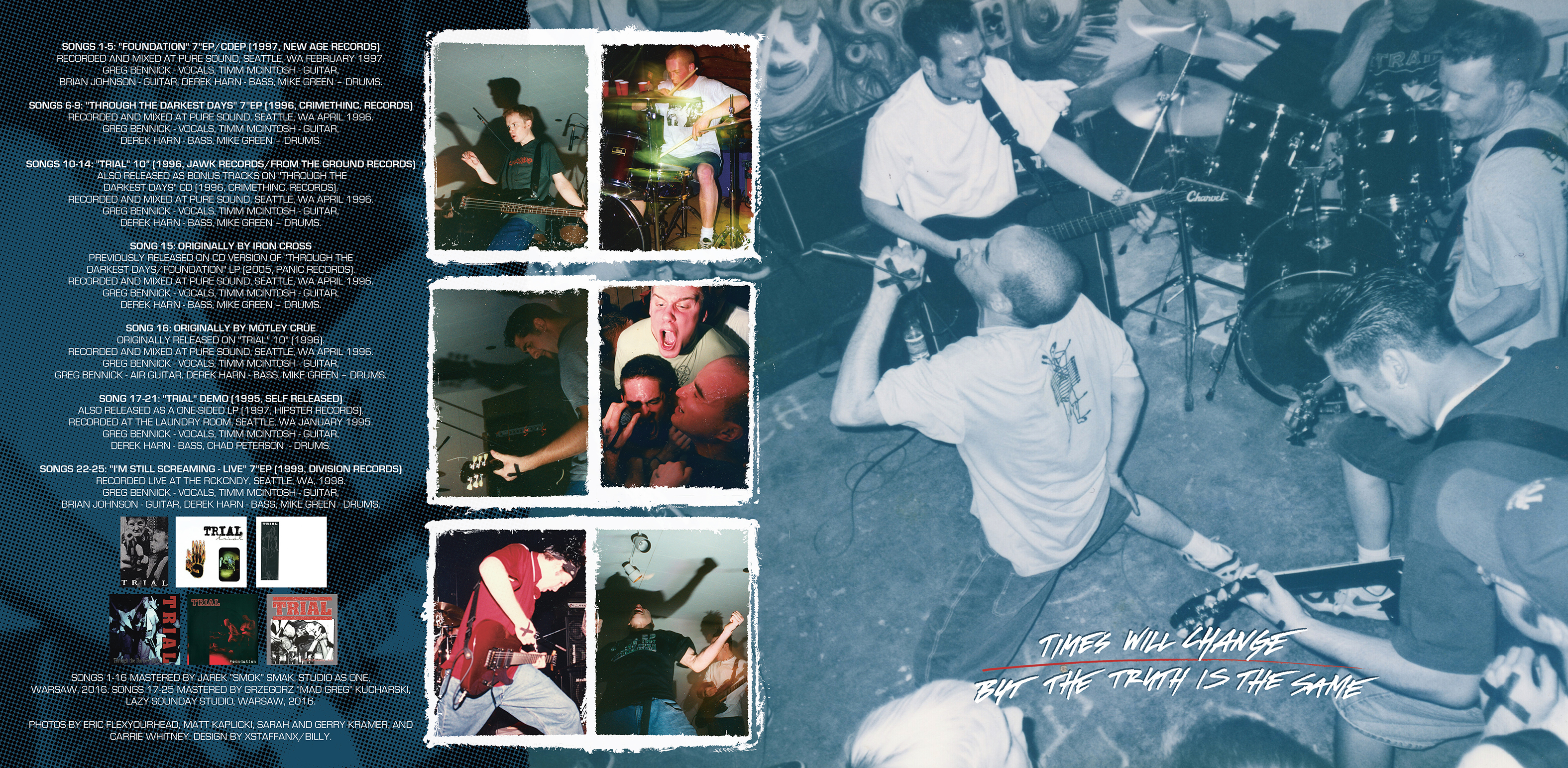
The inside of the gate-fold has my handwriting with a 0.7mm Uni Posca. I love working with those thin sharp Poscas, as they tend to spray a little bit randomly. If you look close you can see that is the case. For the frames around the inside small photos, I used some photo frames I found online, and painted with acrylic on top of them.
The Refuse Records logo on the back was supposed to be smaller. I was sure I had supplied Robert with a version with a smaller logo, and he didn’t ask again for one, but somehow this version slipped through our fault checking.
Finally, I used XSTAFFAN/BILLY as my credit for the design, so I will now try to add ”Billy” as an alias on Discogs. That in itself was worth all the work here!
Order the record from Refuse Records